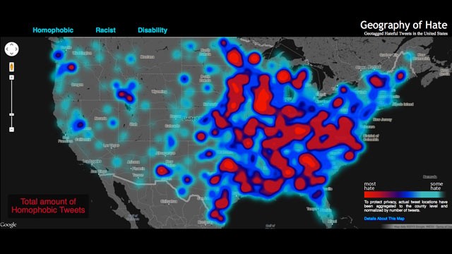
Students at Humboldt State University in northern California analyzed more than 11 months of Twitter data to locate the biggest pockets of hate speech in America.
For the “Geography of Hate” project, students manually sifted through more than 150,000 tweets containing hateful speech targeting sexuality, race, and disability. Student read each tweet to determine whether the slur was used in a positive, negative, or neutral manner. Sample keywords included “homo,” “n*****,” and “cripple.”
To enhance accuracy of the map, researchers “normalized” the data to ensure that larger populations would not appear more racist simply because there are more people living there.
Researchers found that most of the slurs were not centralized to one particular region. A few terms were more concentrated—”wetback,” for example, was more prevalent in Texas than any other state.
The group also mapped racist tweets last November in response to President Obama’s re-election and found high concentrations in Alabama and Mississippi, both traditionally red states.
View the entire “Geography of Hate” map here and read the FAQ that explains its methodology in more detail.
Do any of the results of this project surprise you?


